
While seemingly a trivial task, classifying recipes into cuisines and understanding how to interpret clustering and classification results can help you creatively answer other questions. Continue reading to learn how.
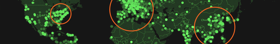
Cyber attacks are becoming more common as more data are stored in digital form. Suspicious, and likely malicious, users are requesting access to unauthorized resources while hoping for vulnerable networks or systems. Continue reading to learn how to apply descriptive analytics to uncover who is generating these suspicious requests.

Neural networks are a growing area of research and are being applied to new problems every day. The classic examples are image classification, facial recognition, and self-driving cars. The future is uncertain, but there is a high probability that neural networks in some form will play a critical role in shaping it. Continue reading to learn about the core concepts and walk through an example in Python.
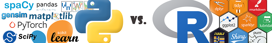
Data science is a broad and deepening field but one divisive question still remains. In this post, I compare and contrast Python and R for use in different data science tasks. Continue reading to learn which one emerges triumphant.