Interpreting Machine Learning with SHAP
SHAP or Shapley Additive Explanations helps you understand ML models.


Table of Contents
- Understanding Model Interpretability
- How SHAP works
- SHAP Example with CatBoost
- Closing
- Additional Resources
- A Unified Approach to Interpreting Model Predictions by Scott M. Lundberg and Su-in Lee from the University of Washington
- From local explanations to global understanding with explainable AI for trees by Scott M. Lundberg et al.
1. Understanding Model Interpretability
Purpose of Model Interpretability
As data sets increase in size, computing increases in speed, and models increase in complexity, machine learning reaches new levels of precision. While we may be able to answer more questions or solve more problems, we also have a higher hurdle to understand and explain our models. We need to know whether the results are usable. For that, the model must provide (some level of) explanation or interpretation of the predicted results.
Consider the case of a local government and corrections authority using machine learning to reduce backlogs of bail or parole decisions by assessing risk of avoiding court dates, or worse, criminal recidivism to the individuals charged with certain crimes. Putting aside socio-economic concerns of using a model in this example (e.g., race, gender, age), one could easily defend the position that the accused deserve an explanation of what makes them a higher risk than their peers.
But how can we understand our answer? How can we understand what makes a model bend and contort the inputs we give it to the outputs it gives us? Previous methods provide an ability to peer into black-box machine learning models, though many of these approaches are model specific and lack certain desired characteristics. SHAP, short for SHapley Additive exPlanations, attempts to unify these methods.
2. How SHAP works
Explanation Models
An explanation model, often denoted g(x′), is a model constructed to explain a more complex model (or a model with more complex inputs), often denoted f(x). The simplified inputs, x′ used in g are mapped from x using a function x = h(x′). If this is confusing, the simple explanation is that people are building simpler models to explain their other, more complex models. None have been perfect, but previous attempts to solve this problem have been made. All of these attempts have been additive feature attribution methods which the paper defines as “a linear function of binary variables”.
The authors walk through the following examples explaining how each of these existing additive feature attribution methods attempt to map f and g.
- LIME (Local interpretable model-agnostic explanations)
- DeepLIFT
- Layer-wise Relevance Propagation
- Three classic Shapley value estimation methods (Shapley regression values, Shapley sampling values, Quantitative input influence)
SHAP Values
An important concept underpinning the paper's perspective on machine learning interpretation is the idea of ideal properties. There are 3 ideal properties, according to the authors, that an explanation model must adhere to: local accuracy, missingness, and consistency. Please refer to the SHAP paper for a mathematical definition, derivation, and description of these properties. The two main takeaways are:
- There exists only one explanation model that adheres to the definition of an additive feature attribution method and possesses all three properties (i.e., one unique solution).
- None of the previous additive feature attribution methods described above hold all 3 properties.
The authors introduce SHAP values as the unique solution or explanation model that does possess all 3 properties. However, calculating the precise SHAP values is a difficult problem and so we rely on approximation methods.
SHAP Value Approximation Methods
- KernelSHAP - a model agnostic method for model explanations
- DeepSHAP - an adaptation of DeepLIFT for neural network explanations
- TreeExplainer - an explanation method for trees and tree-based models (XGBoost, CatBoost, etc.)
Each of these approximation methods vary in implementation so please refer to the respective papers and/or Github repository for more detail.
The authors’ last section discusses how SHAP aligns more closely with human interpretation and intuition. A user study showed that study participants preferred, aligned, and agreed with the SHAP explanations more so than with previous methods. We have covered the definitions used in SHAP and discussed what makes SHAP unique and how it works.
3. SHAP Example with CatBoost
Let us pivot from the theoretical underpinnings of SHAP to the very practical use of SHAP. This example revisits a recidivism data set previously discussed here. For full details of the data set, please visit the previous post. The keys to remember are the rows represent individuals from Broward County, Florida charged with crimes and our outcome of interest is 2-year recidivism. These results are simply for the purposes of illustrating SHAP and have not been evaluated for any meaningful or significant causal inference, etc.
As usual, we start by loading the dependencies and data set which include: numpypandassklearncatboost and shap.
# Import dependencies
import numpy as np
import pandas as pd

from sklearn import preprocessing
from sklearn.model_selection import train_test_split

from catboost import CatBoostClassifier

import shap

# Initialize js (this is needed if you want to show interactive plots in your notebook)
shap.initjs()

# Read data and print shape
data = pd.read_csv('./data/compas-scores-two-years.csv')
data.shape
We have about ~7200 individuals. While this data set is not immense in number of rows, columns, or variation - we can use this data set to explore the core elements of shap. This is usually when we would continue with feature engineering, data cleaning, handling missing values, etc. - but since we are focused on exploring SHAP, we can skip those steps.
(7214, 53)With that being said, shap returned an error when providing categorical features. So for simplicity sake, we use sklearn to encode our categorical variables: sexrace, and charge degree. We also use this moment to split the data set into standard X, y sets. We can peek into our data set and see that all of our values are now numeric. We’ll use the LabelEncoder.inverse_transform() method to revert encoded values back to categories.
# Encode the categorical variables
le_sex = preprocessing.LabelEncoder()
data['sex'] = le_sex.fit_transform(data['sex'])

le_race = preprocessing.LabelEncoder()
data['race'] = le_race.fit_transform(data['race'])

le_cdeg = preprocessing.LabelEncoder()
data['c_charge_degree'] = le_cdeg.fit_transform(data['c_charge_degree'])


# Define features and target
features = [
    'sex',
    'age',
    'race',
    'juv_fel_count',
    'juv_misd_count',
    'juv_other_count',
    'priors_count',
    'c_charge_degree',
]
target = 'two_year_recid'

# Split data into X, y
X, y = data[features], data[target]

X.head()
sex age race juv_fel_count juv_misd_count juv_other_count priors_count c_charge_degree
0 1 69 5 0 0 0 0 0
1 1 34 0 0 0 0 0 0
2 1 24 0 0 0 1 4 0
3 1 23 0 0 1 0 1 0
4 1 43 5 0 0 0 2 0We’ll train/test split our data and do a quick check to see overall how many cases of two-year recidivism we find in our data set.
# Split data into train, test sets
X_train, X_test, y_train, y_test = train_test_split(X, y, test_size=0.2, random_state=2021)

# Evaluate the target variable proportions
pd.DataFrame([pd.Series(y).value_counts(),
              np.round(pd.Series(y).value_counts(normalize=True), 2)],
             index=['Count',
                    'Percent']).T
Count Percent
0 3963.0 0.55
1 3251.0 0.45Next, we will train our CatBoostClassifier() using the train data set and shap.TreeExplainer to look at a force_plot() for one individual. Typically, we would evaluate our model against a validation data set and tune as needed - since this model is merely for an exercise in SHAP, we will skip that step.
# Instantiate model
model = CatBoostClassifier(
    iterations=15,
)

# Fit model
model.fit(X_train, y_train,
          eval_set=(X_test, y_test),
)

# Use tree explainer to explain our CatBoost model
explainer = shap.TreeExplainer(model)
shap_values = explainer.shap_values(X)

# Look at the 101st individual and the explanation of values
shap.force_plot(explainer.expected_value, shap_values[100,:], X.iloc[100,:])
The particular individual that we chose is male (shown as 1), 24 years old, and has a prior conviction. What is new about this view is that we can see both the direction each variable influences the outcome (2-year recidivism) as well as the magnitude. This image represents how this individual was perceived by the model.
- Age - 24 (Recidivism risk ↑): Being 24 and on the younger side of the data set, the individual's risk of 2-year recidivism is judged to be higher by the model.
- Current charge degree - Felony (Recidivism risk ↑): The charge is classified as a felony and the model believes this slightly increases the risk of 2-year recidivism.
- Priors count - 1 (Recidivism risk ↓): Only having one prior charge is favorable for this individual. This value dramatically reduces the perceived risk of 2-year recidivism.
By rotating all individual force plots, we can see the variable effects for every individual. Since we have several thousands of individuals and the force plot is slow to generate with that many rows of data, we take a sample of 10%. If you have enabled JavaScript to run in your notebook, then this plot will be interactive - you can hover above a given individual (or row of data generally) and view the values.
# Show 10% of training set predictions
np.random.seed(2021)
random_mask = np.random.choice(a=[0,1], size=y.shape, p=[0.9,0.1])
shap.force_plot(explainer.expected_value, pd.DataFrame(shap_values)[random_mask == 1].values, X[random_mask == 1])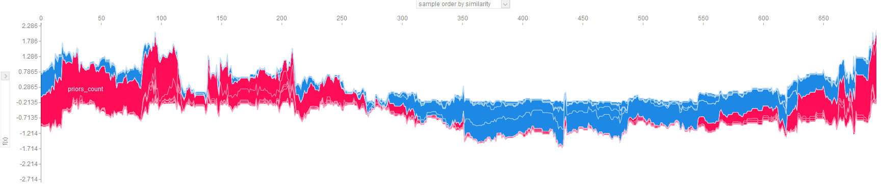
This plot is dense and there are many considerations to make:
- The values are sorted by default in order of similarity. The sort order can be changed using the top dropdown to: similarity (default), output/target value, original order, or by any feature.
- The left dropdown will allow you to filter to view the SHAP impact for a single feature.
- Values higher on the vertical axis indicate higher likelihood of 2-year recidivism. Values lower on the vertical axis indicate a lower likelihood of 2-year recidivism.
- Values that are red drive the recidivism risk up. Values that are blue drive the recidivism risk down.
- There is a balance in the dataset and if we evaluated the model, it may indicate relatively strong performance.
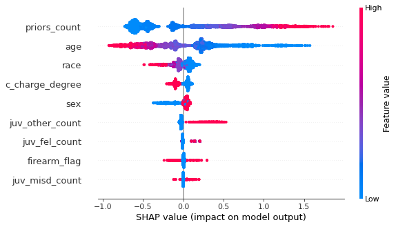
# Show summary of all feature effects
shap.summary_plot(shap_values, X)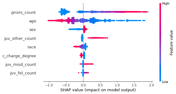
We can plot the summary view of each model feature by using the summary_plot() function in shap. This plot shows the direction and magnitude of the feature and colors the values by the feature value. For example, values that are high in priors count (meaning more prior convictions) are shown in red, lower counts are shown in blue. This plot is one of the most valuable plots available in SHAP and we can make a few observations.
Notice that the features are presented in descending order of ‘SHAP importance’. The features closer to the top drive the 2-year recidivism values to more extreme highs and/or lows. As expected, priors_count and age are the most explanatory features. If an individual has a higher count of prior convictions, SHAP explains that our model predicts this individual is more likely to recidivate within 2 years. The opposite effect can be observed for age - older individuals have a lower likelihood of 2-year recidivism. Furthermore, observe that the charge degree (i.e., misdemeanor vs felony) is low in magnitude but consistently separated by SHAP value - individuals with a felony charge have slighlty higher risk.
SHAP let’s us take this model interrogation one step further by using dependence_plots(). These plots allow us to view the relationship between the feature and the feature’s impact in the model in a 2-D scatter visualization. Additionally, we can view how another variable interacts via the color/hue.
# Show dependence between variables and shap values
shap.dependence_plot("priors_count", shap_values, X, interaction_index="age")
shap.dependence_plot("sex", shap_values, X, interaction_index="age")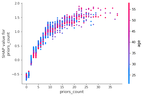
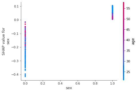
In the example above, we have two relationships plotted: priors_count and sex with both showing the interactions with age. A keen observer will note the following:
- Priors count has a positive relationship with its associated SHAP value - more priors indicates a larger positive impact on the likelihood of recidivism.
- The presumption of being older always meaning a person is less likely to recidivate is unfounded - we can see this through the interaction with age - as the crisp seperation of red and blue points melts into purple.
- Sex of the individual has a moderate impact on the SHAP value as well - women generally show less likelihood to recidivate within 2 years according to our model. However, notice how the interaction with age is inverted between men and women. Older men are less likely to recidivate than their younger peers, while the same appears to be true for younger women.
Firearm Feature
If you remember the previous analysis using this data set, we had engineered several features including whether or not a firearm was present in the charge description. What happens if we include a feature indicating whether a firearm is mentioned in the charge description? How will this affect the results?
# Define firearm or weapon related phrases:
firearm_phrases = [
 "firearm",
 "w/deadly weapon",
 "W/Dead Weap",
 "W/dang Weap",
 "shoot into veh",
 "missile",
 "weapon",
 "Poss Wep Conv Felon",
 "Poss F/Arm Delinq",
]

data['firearm_flag'] = 0
for phrs in firearm_phrases:
    data['firearm_flag'] = np.where(data['c_charge_desc'].str.contains(phrs, case=False), 1, data['firearm_flag'])

# ... code to retrain catboost model omitted

# Use tree explainer to explain our CatBoost model
explainer = shap.TreeExplainer(model)
shap_values = explainer.shap_values(X)

shap.force_plot(explainer.expected_value, pd.DataFrame(shap_values)[random_mask == 1].values, X[random_mask == 1])
shap.summary_plot(shap_values, X)
shap.dependence_plot("firearm_flag", shap_values, X, interaction_index="age")
Notice how in this updated force plot that the firearm_flag does have a large impact - however, in this individual’s case it may be counterintuitive. This individual’s charge description did contain references to a weapon or firearm, and yet this drove the likelihood of recidivism downward ↓. The majority of the other feature values appear to be consistent with expectations. Let’s take a look to see if the summary and dependence plots reveal any new insights.
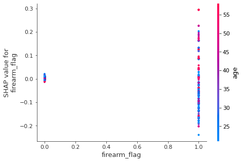
- Even though the individual example had a noticeable impact from
firearm_flag, the feature is relatively unimportant according to the model. - By including the
firearm_flag, theraceindicator moved up in importance to 3rd overall. We also see slightly more separation between the race categories, can you guess which color represents which racial/ethnic group identity? There are 6 groups. That discussion is out of scope for this demo of SHAP.
- Having a charge description that references a firearm or weapon indicates more variability in SHAP value, but no clear direction of the effect.
- The effect seen by
ageoverall is inverted when a firearm is involved. Younger individuals with a firearm are less likely to recidivate than older individuals with a firearm. This finding means there's likely another interaction at play.
4. Closing
Recall the primary purpose or calling for SHAP: unifying a handful of methods for interpreting machine learning models. Whether through the technical demo or the theoretical representation, we can see how SHAP provides a unified approach to explaining our machine learning models. The shap package provides plots to help make black-box models more transparent - force plots, summary plots, and dependence plots. Machine learning models have learned a lot from our data, it’s time we learn from our models. Taking the concept of SHAP further is SAGE which you can read more about and its relationship with SHAP here: https://iancovert.com/blog/understanding-shap-sage/.
So, will you get into SHAP? How will you make SHAP your own or make your own SHAP… the SHAP of you? Take a look at the additional resources below to learn more about SHAP and to learn more about your machine learning models.
5. Additional Resources
If you are curious and want to learn more about the subject of interpretability of machine learning, I recommend Christoph Molnar’s book. If you want to start using SHAP, please visit the Github page. Else, if you want to continue diving deeper into SHAP, please look at the last 3 links below - the SHAP paper itself, a paper on explaining tree-based models, and a post on SHAP from TowardsDataScience.com.
- Molnar, Christoph. "Interpretable machine learning. A Guide for Making Black Box Models Explainable", 2019. https://christophm.github.io/interpretable-ml-book/.
- Github: SHAP package
- NeurIPS: A Unified Approach to Interpreting Model Predictions (Lundberg, Lee)
- Nature.com: From local explanations to global understanding with explainable AI for trees
- TowardDataScience.com: Explain Your Model with the SHAP Values by Dr. Dataman